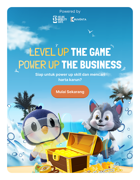
Kouventa
[UI/UX Design]
[Website Revamp]


Scroll down
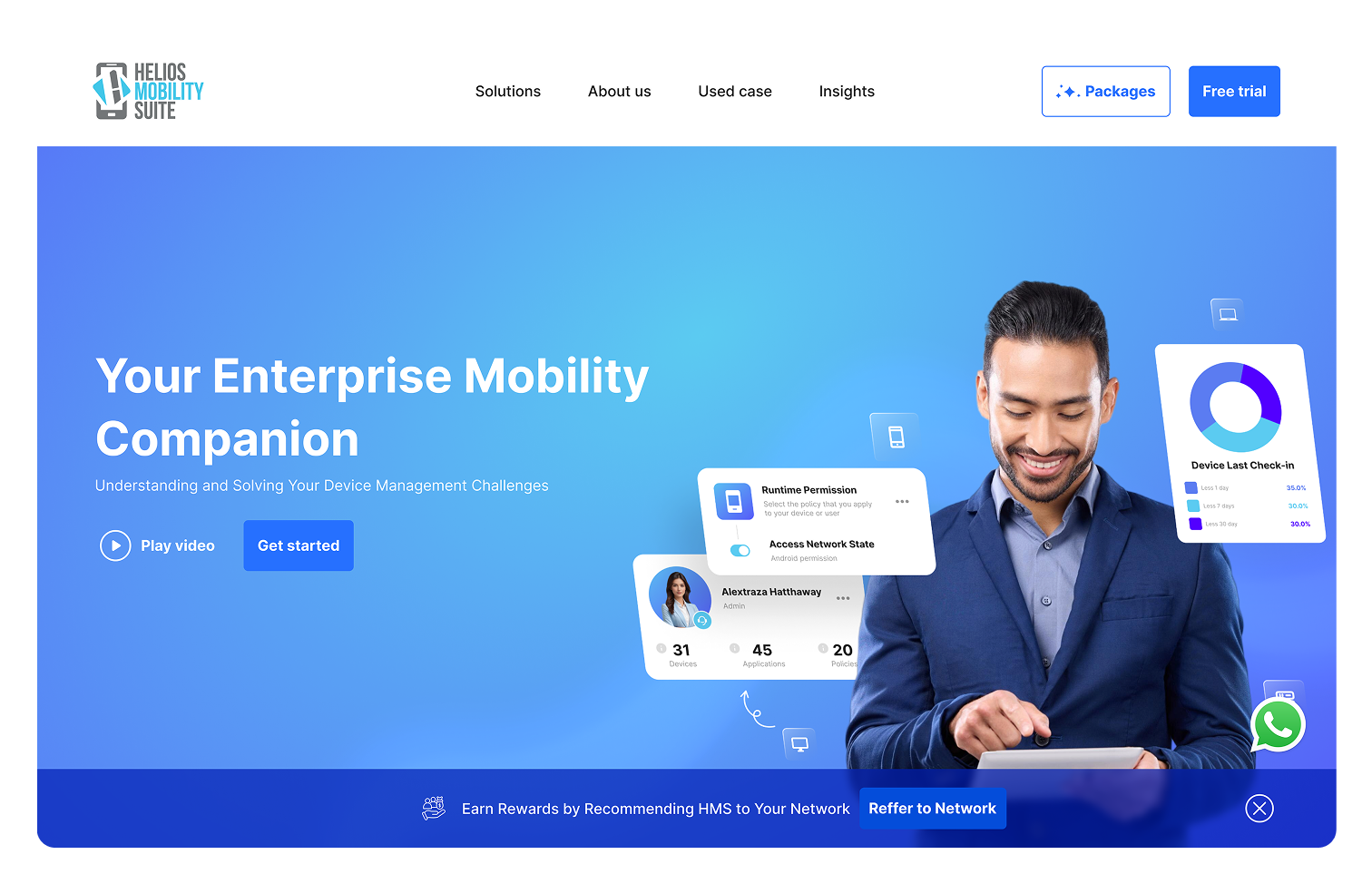
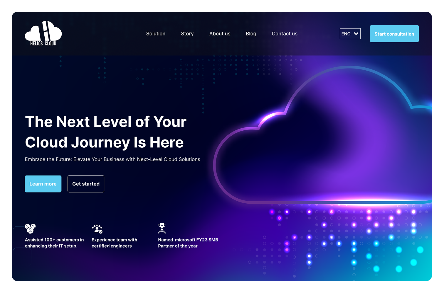
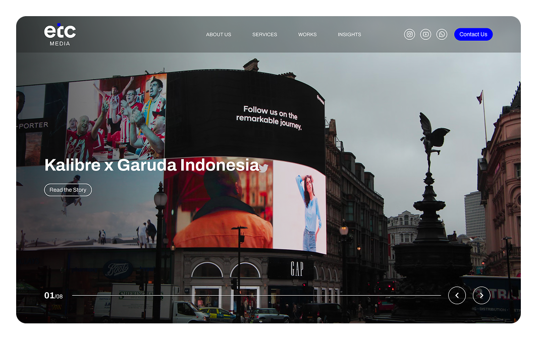
Client
Service
A customer tries to explore services on their phone. The text is tiny, the menu is hidden, and images spill off the screen. Frustrated, they leave and never return. 70% of our traffic was mobile, but we were treating them like second class users.
New users land on your site but feel lost. There’s no clear path, too many buttons, and jargon-filled menus. They scroll, hesitate, then leave. Users didn’t know what to do next.
Conversions are weak. Forms are long. CTAs are buried. Users hesitate because they can’t find enough proof or feel guided. Not guiding them to action.
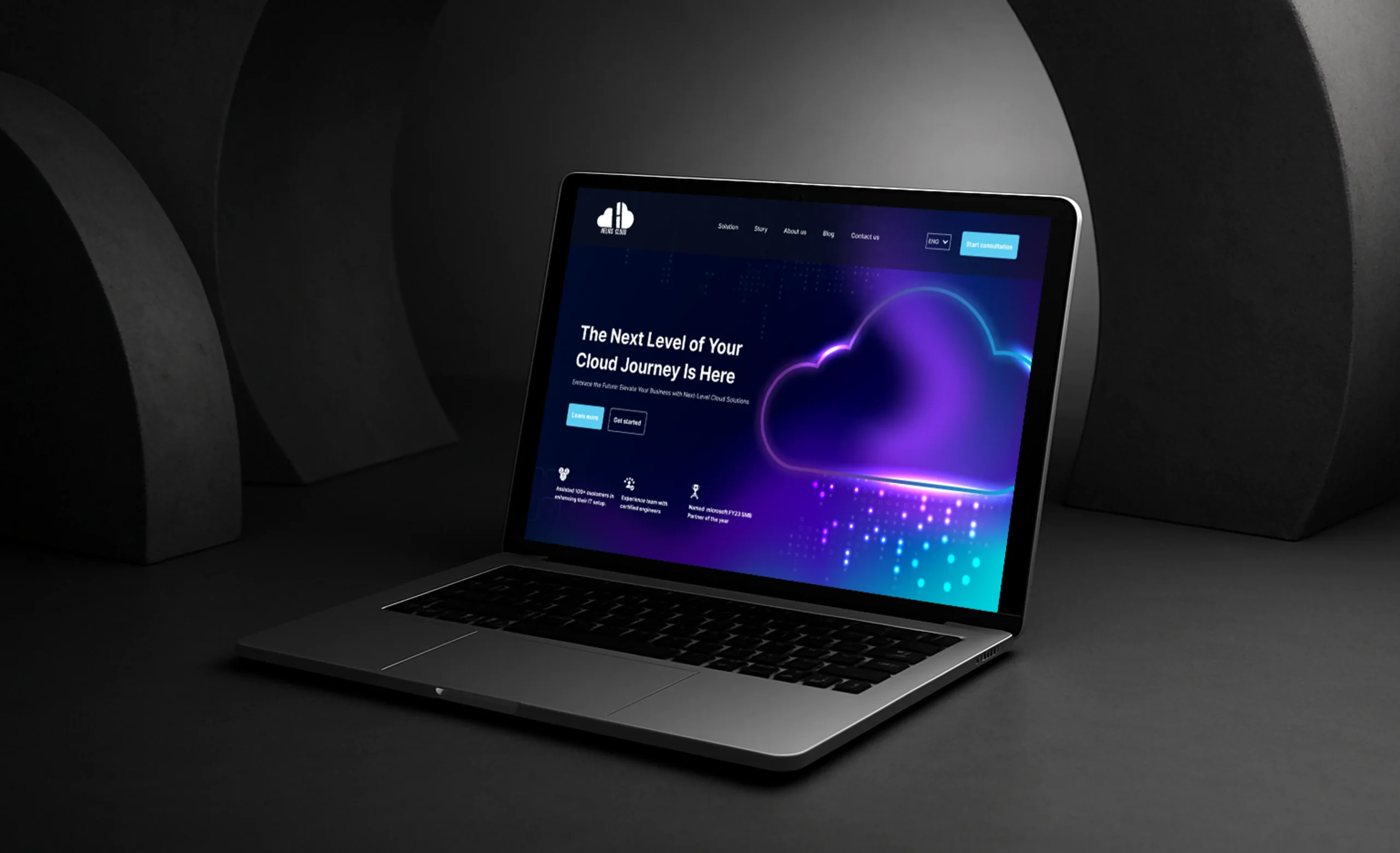
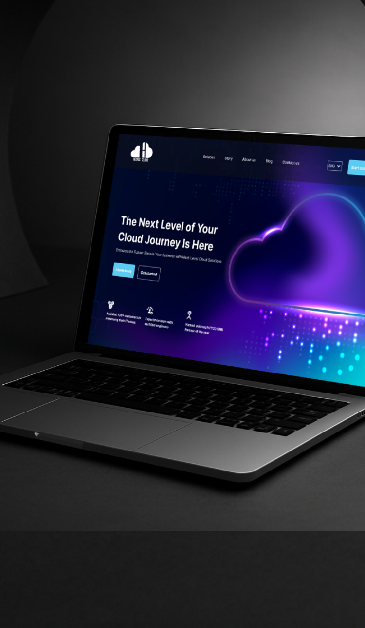
A cluttered layout, color from the past decade, and pixelated images. Even though the business has grown, the site still reflects its early-stage startup days. Potential clients bounce before reading a word. A disconnect between the company’s current image, color and the website’s look.
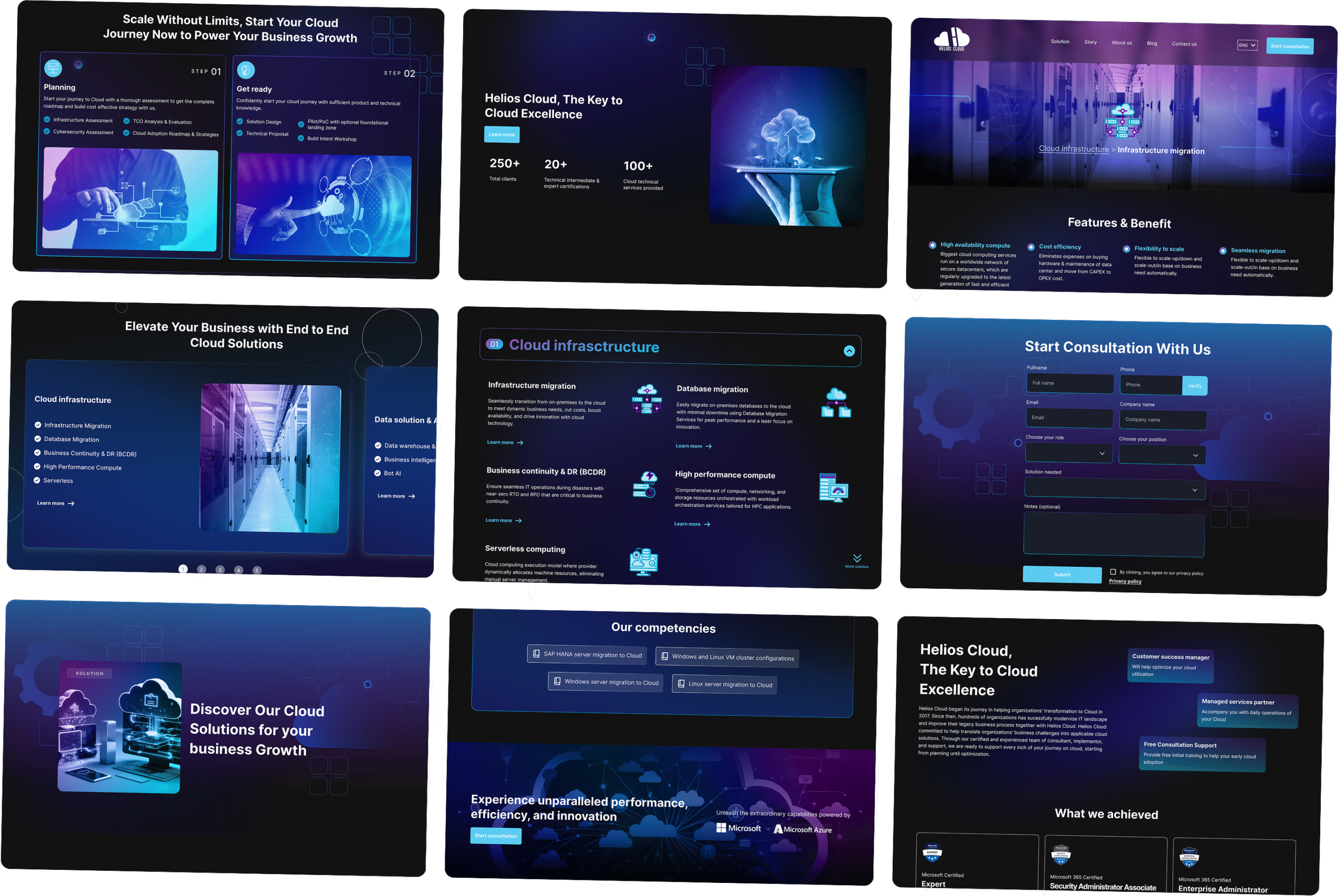
Redesigned the site with a mobile first approach, ensuring layouts adapt seamlessly across devices and screen sizes. Navigation, typography, and imagery were optimized for mobile usability. Touch targets were enlarged, menus were restructured into accessible mobile formats, and performance enhancements were applied for faster load times on mobile networks.
Restructured the site’s navigation based on user journey analysis and card sorting insights. Redundant links and pages were removed, jargon was simplified, and a clear visual hierarchy was implemented. The new layout guides users through a defined path using progressive disclosure, consistent CTAs, and contextual navigation elements.
Redesigned CTA placements using behavioral heatmaps. CTAs are now more prominent, concise, and visually differentiated. Forms were shortened, friction was reduced, and trust signals such as testimonials and value propositions were positioned strategically near key CTAs to boost user confidence and conversions.
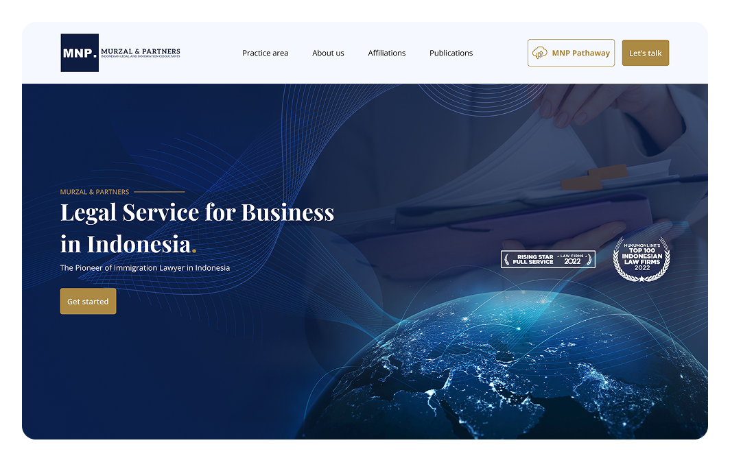
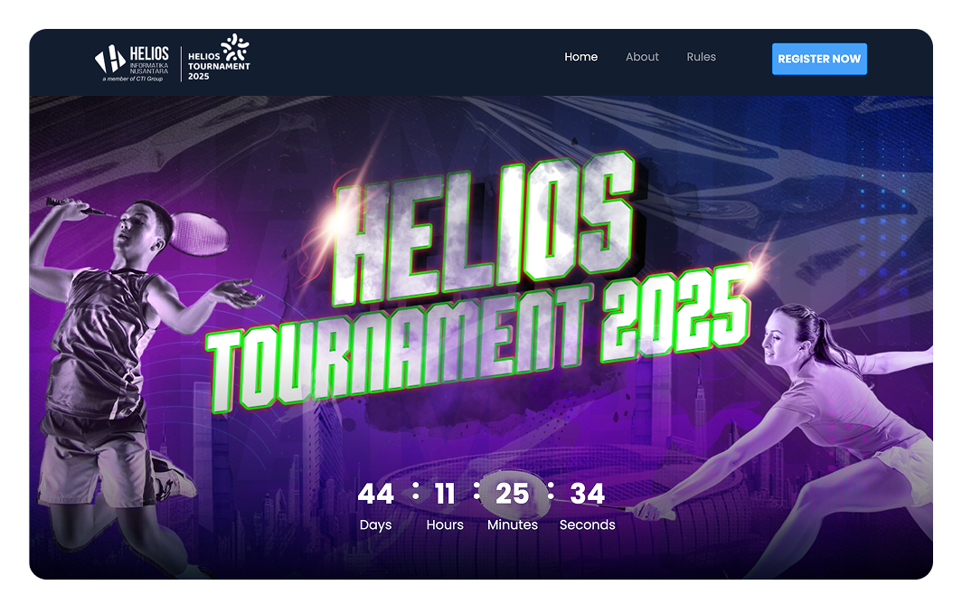
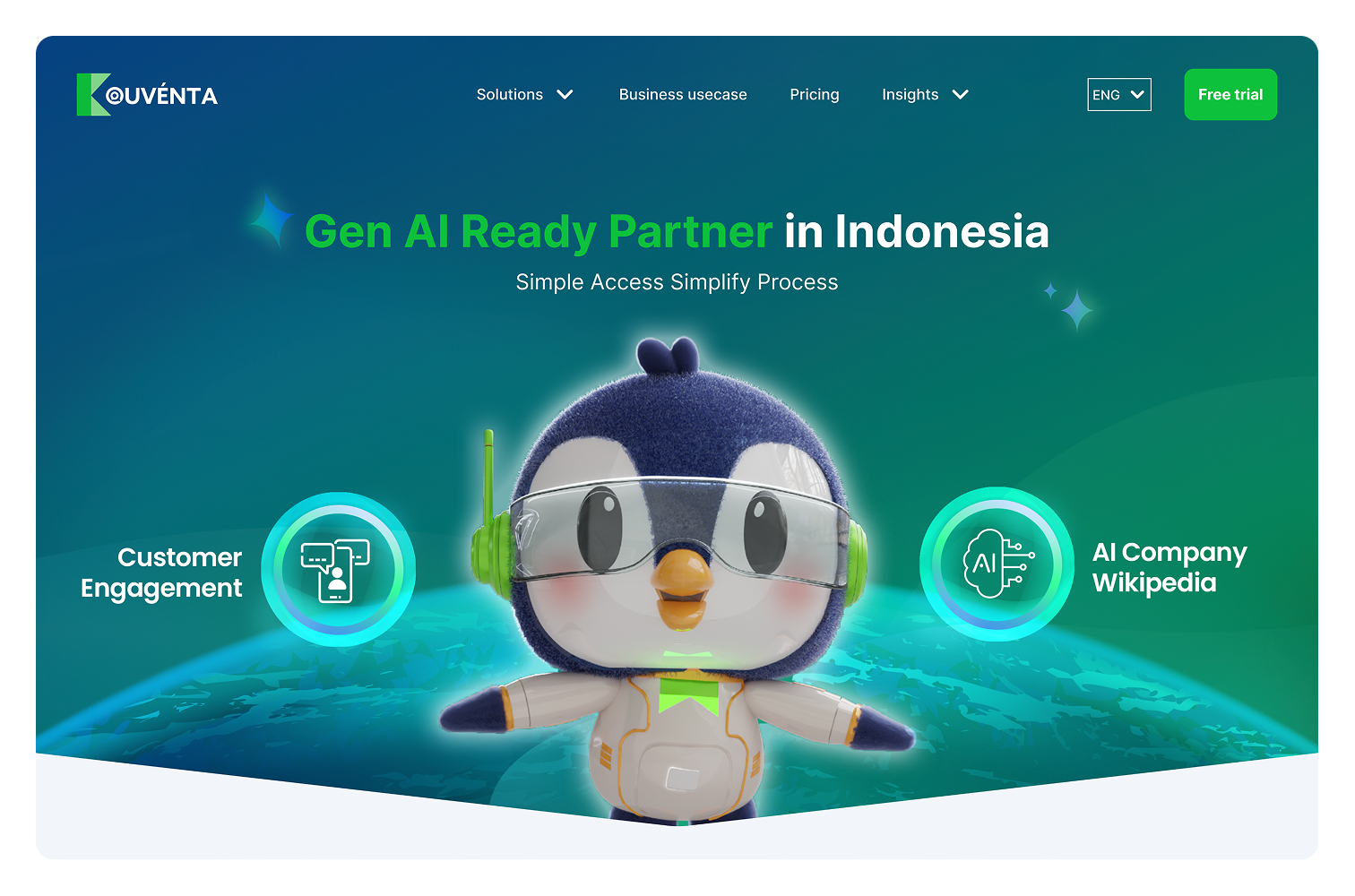
Conducted a visual audit and rebranded the UI to align with the company’s current identity. A modern design system was established featuring updated typography, a refined color palette, and high-resolution media assets. This refreshed look and feel reinforces credibility, modernity, and brand trust.

See Mockup