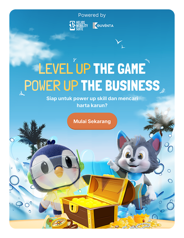
Kouventa
[UI/UX Design]
[Website Revamp]


Scroll down
Client
Service
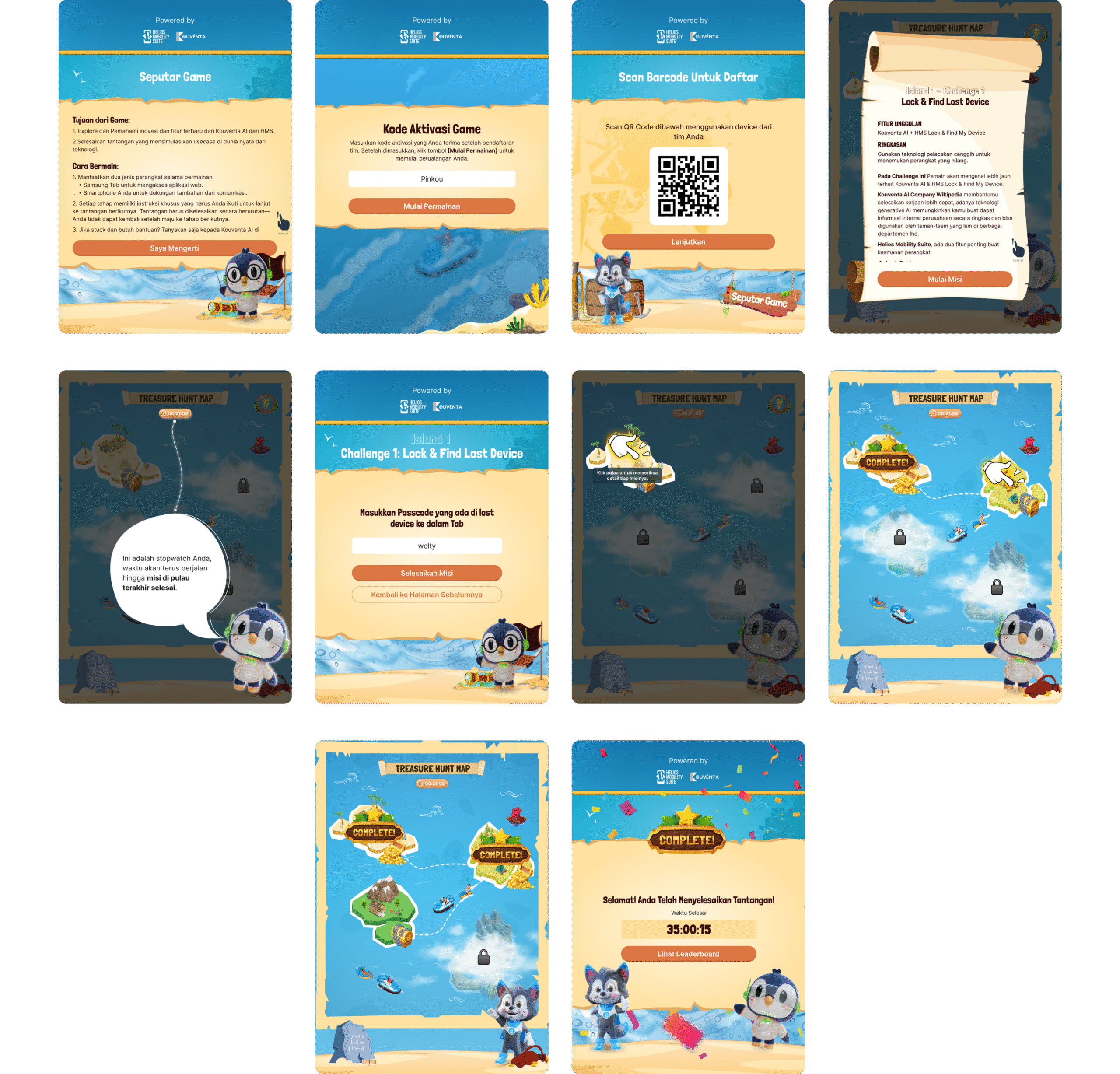
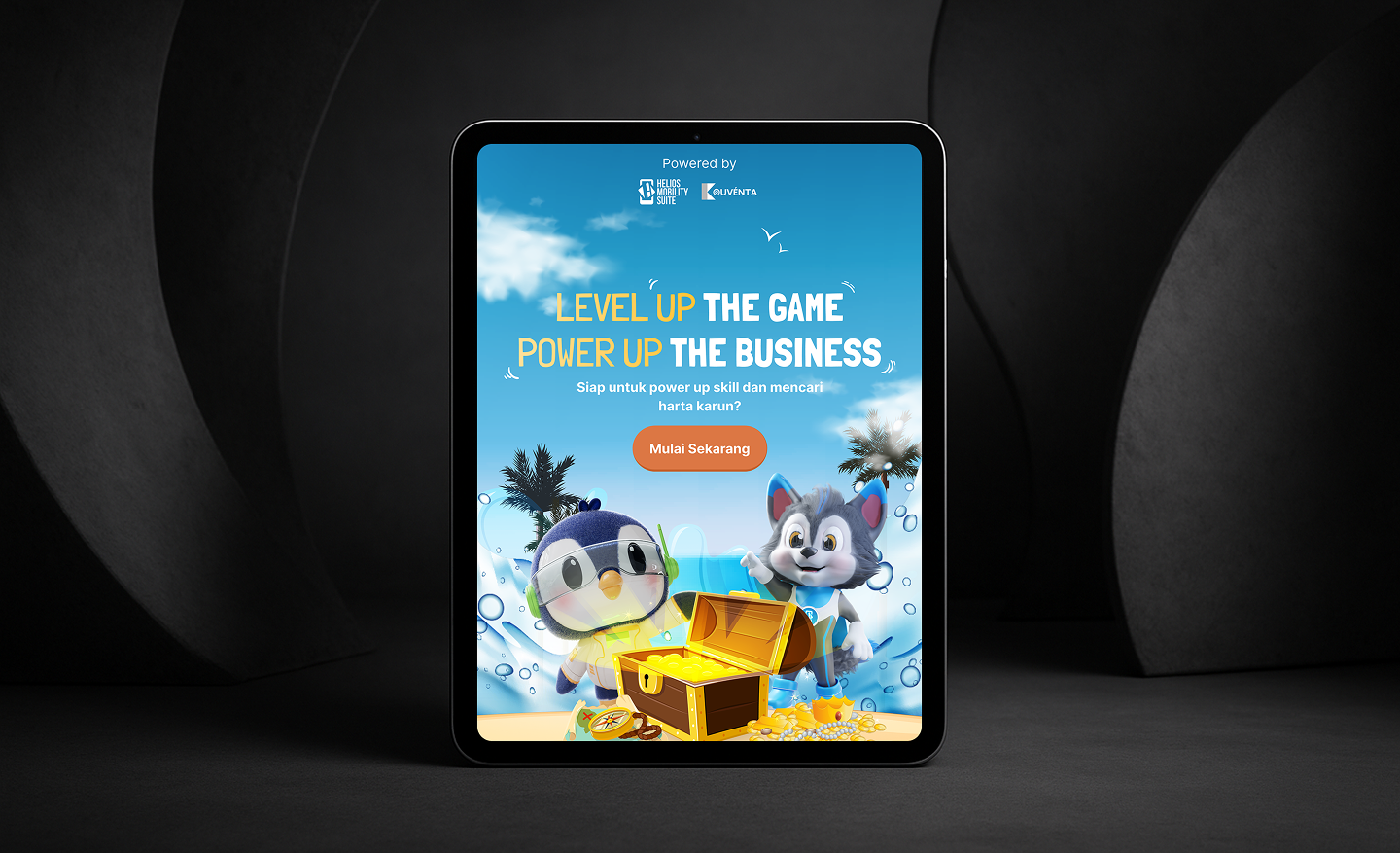
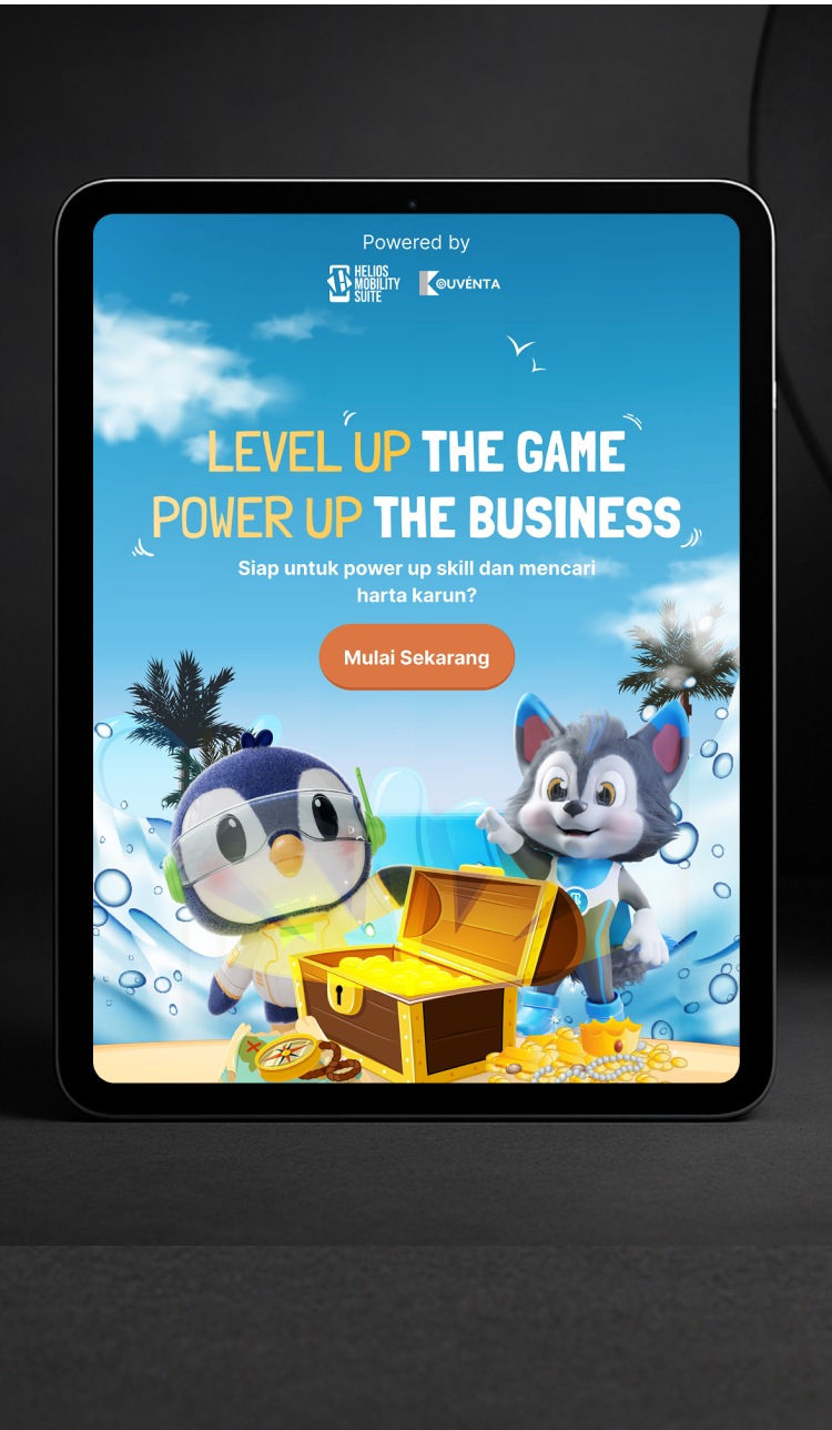
UI tone is everything tablets blur the line between web and app, so your game has to look like a game from button, style, and visual.
The game layout starting from mobile it looked great on phones. But when opened on a tablet, the UI elements stayed small, clustered in the center, surrounded by too much dead space. It felt like the mobile version just got stretched out, not adapted.
Designed the visual identity to reflect playful, game like aesthetics rather than a corporate or app like tone. Buttons were given tactile depth, animations were introduced for feedback, and we applied a vibrant, thematic color palette with custom iconography. Typography, shadows, and micro interactions were tailored to evoke a game atmosphere not a dashboard or productivity tool. This helped increase user immersion and made the game instantly feel fun and engaging on tablet screens.
Build the layout using tablet specific breakpoints and an adaptive grid system. Instead of scaling elements linearly, we redistributed space proportionally, adjusted margins, and reorganized component placement to maintain visual balance. UI elements were resized to match touch ergonomics and screen real estate. This ensured that the tablet experience wasn’t a stretched mobile clone but a purpose built, comfortable, and spatially optimized interface for tablet users.

See Mockup