

Kouventa
[UI/UX Design]
[Website Revamp]


Scroll down
Client
Service
A customer tries to explore services on their phone. The text is tiny, the menu is hidden, and images spill off the screen. Frustrated, they leave and never return. 70% of our traffic was mobile, but we were treating them like second class users.
Visuals look old fashioned or inconsistent with current branding. A disconnect between the company’s current image, color and the website’s look.
Too many CTAs or unclear next steps, Important actions buried or hard to find. Users didn’t know what to do next.
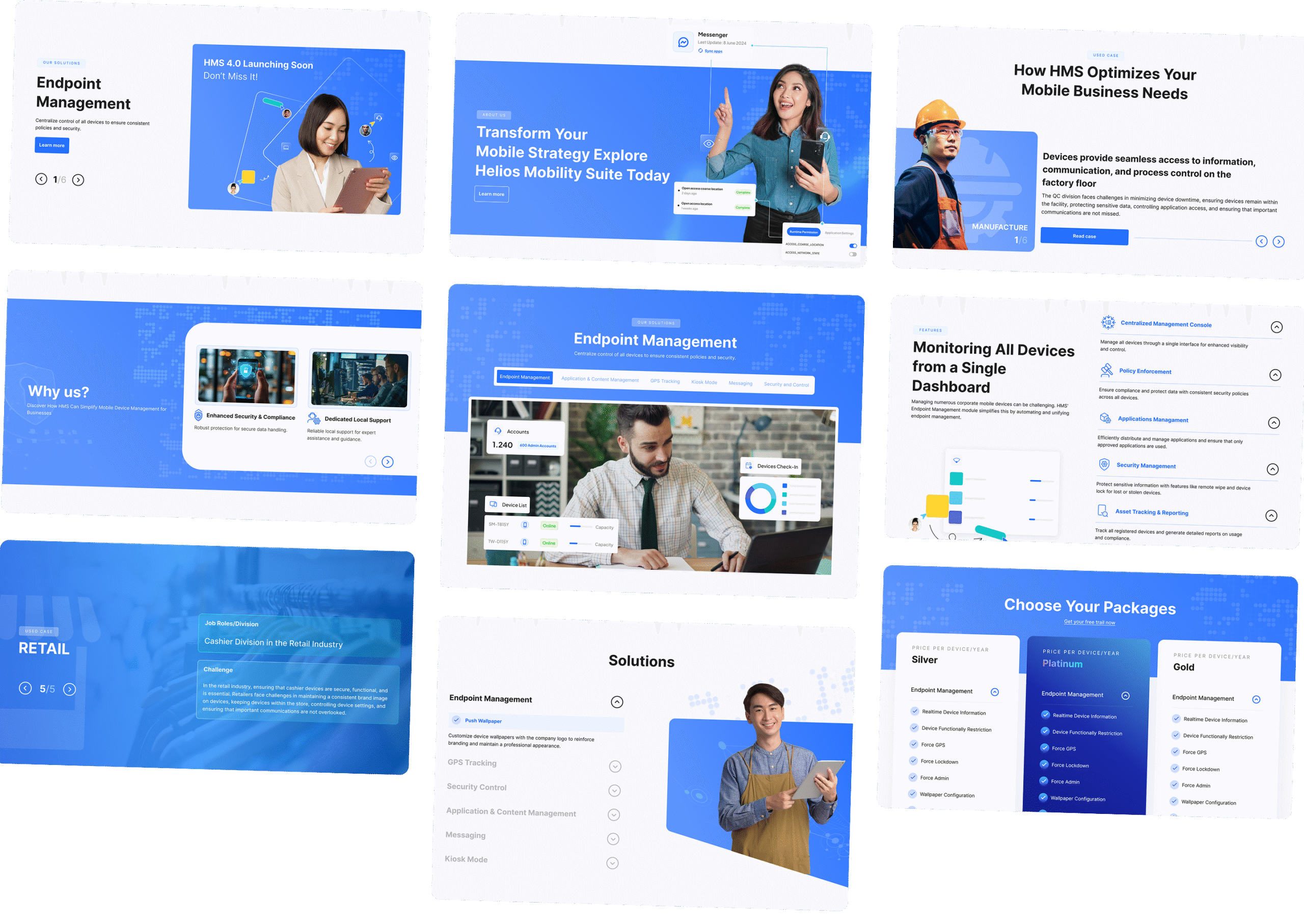
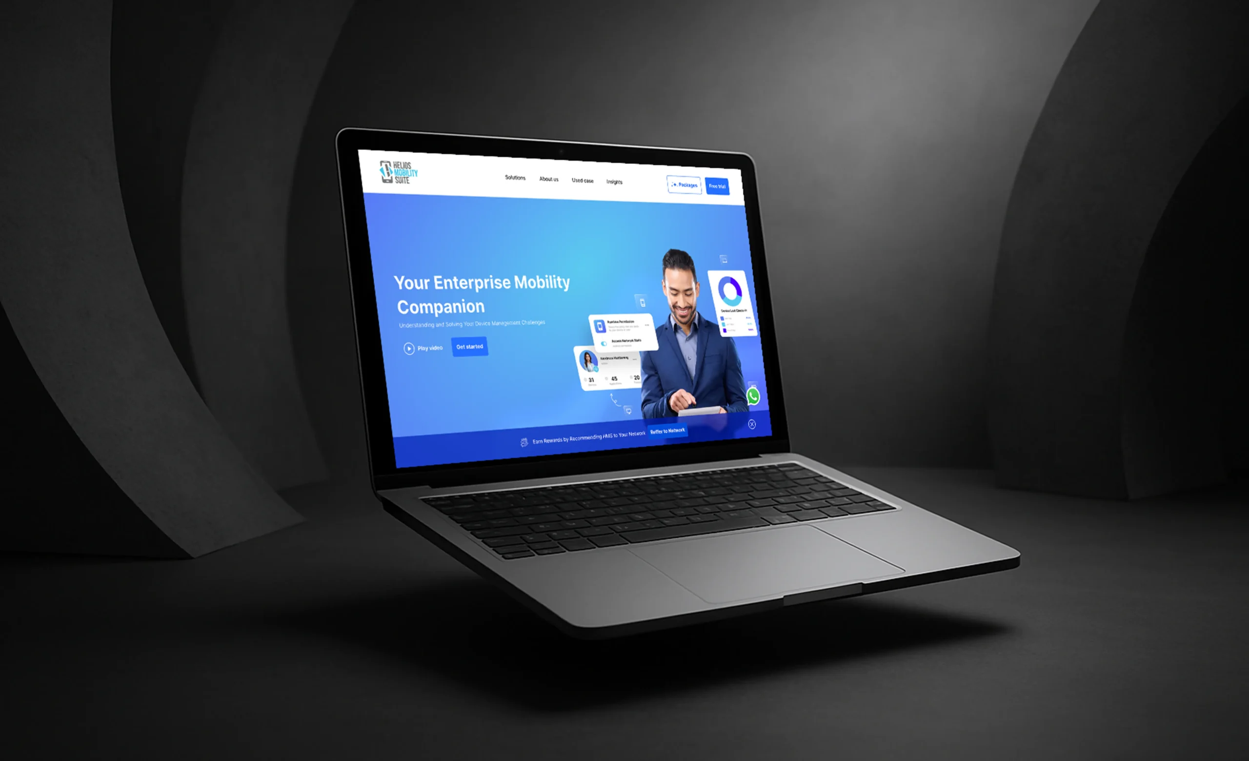
Redesigned the site with a mobile first approach, ensuring layouts adapt seamlessly across devices and screen sizes. Navigation, typography, and imagery were optimized for mobile usability. Touch targets were enlarged, menus were restructured into accessible mobile formats, and performance enhancements were applied for faster load times on mobile networks.
Conducted a visual refresh to align the interface with current branding and user expectations. This included updated typography, a modern color palette, cleaner UI components, and higher-resolution assets. We also introduced a design system to ensure consistency across pages and future scalability. The result is a more polished, trustworthy, and visually appealing site that reflects the brand’s current identity.
Restructured the user flow based on user journey mapping and behavior data. CTA buttons were prioritized using a clear visual hierarchy, redundant options were removed, and key actions were made more prominent. Navigation was simplified and page content reorganized to support intuitive progression. This helped guide users more effectively, reduce friction, and increase conversion rates.

See Mockup